# DX2 Release Notes 2018
# August
# New Look & Feel
We have refreshed the DX2 User Interface to create a better user experience. This includes:
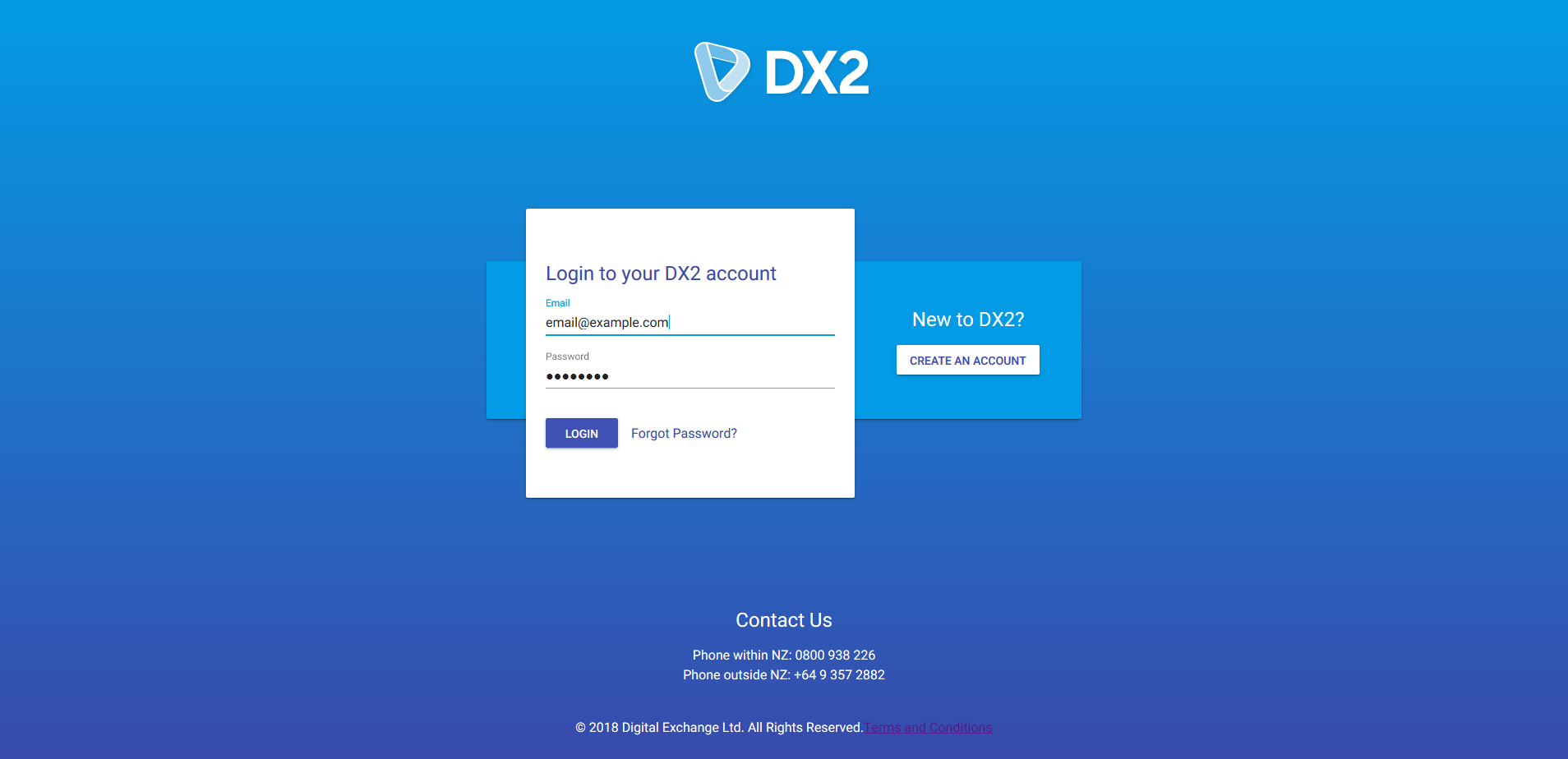
- New login and register page with better accessibility
- Mobile friendly for use across more devices
- Lists and details are easier to read

# Improved Search, Filters & Lists
All lists are now easier to read with a simple, clear layout. Searches and filters are more visible and a new filter has been added so that users can filter by tags.

# Trading Partners & My Company
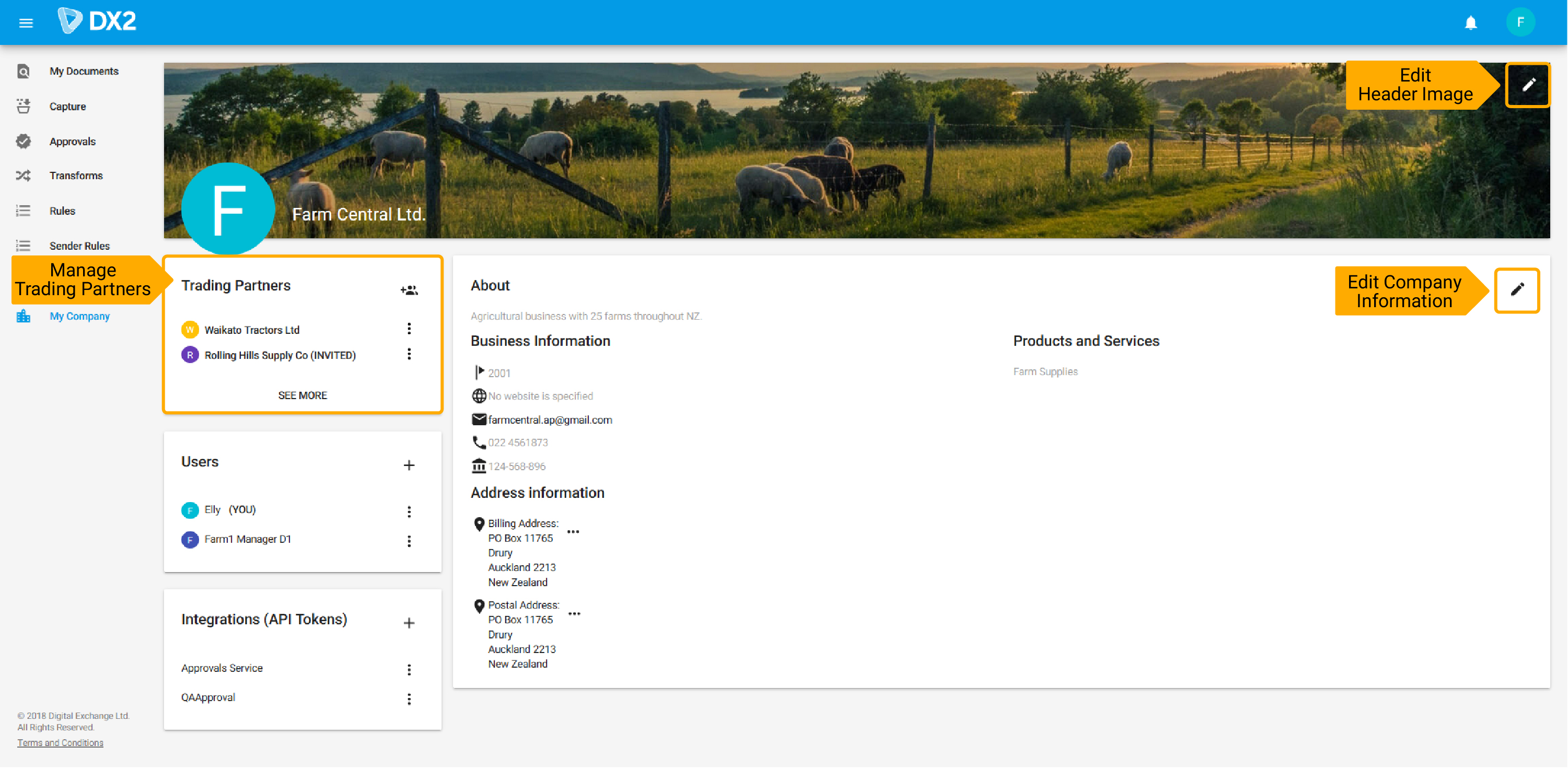
Improvements made to the My Company page include:
- The Trading Partner area has been moved to a card inside the My Company page
- Here you can view, invite and edit Trading Partners
- Company profile picture can be added
- Company header image can be added
- New section for business information
- Products and services description
- User profile picture

# Attachments & Downloads
When viewing a document, a new "Attachments" tab has been added to allow users to easily view and download all attachments. When in the "Raw" tab, the download button has been placed in a more visible location.
